City Emblem
The City Emblem
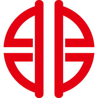
- The design of the emblem was based on the Chinese characters for Taipei (台北), which combine to form an arrow that points both upward and downward to symbolize eternal prosperity. The lines crossing under the center of the arrow’s shaft represent the modern city with its crisscrossing bridges and cultural diversity.
- A rounded version of the Chinese character for longevity (壽), a common decorative symbol in Taiwan, served as the inspiration for this design, to convey a wish for everlasting glory.
- Clean, bold lines were employed to deliver a design that is straightforward and instantly recognizable.

CIS Visual Design
The Cultural Affairs Bureau adopted the concept of the corporate identity system (CIS) and employed the Chinese character for “pei” (北) in Taipei as the main element of the city emblem. Colors were added to the original design to form a logo which is also a visual conception of New Taipei City’s identity. The three primary colors red, yellow, and blue were used as the main hues. Any color can be produced by mixing these three primary colors, a perfect reflection of the brilliance, diversity, solidarity, and inclusiveness of New Taipei City
The Cultural Affairs Bureau adopted the concept of the corporate identity system (CIS) and employed the Chinese character for “pei” (北) in Taipei as the main element of the city emblem. Colors were added to the original design to form a logo which is also a visual conception of New Taipei City’s identity. The three primary colors red, yellow, and blue were used as the main hues. Any color can be produced by mixing these three primary colors, a perfect reflection of the brilliance, diversity, solidarity, and inclusiveness of New Taipei City

The Design Concept of the New Taipei City Government Logo
- The original design, based on the Chinese character for “pei” in Taipei (北), was employed as the main element of the logo, which symbolizes both heritage and innovation.
- Red, yellow, blue, and green hearts converge to form a flower in the shape of a four-leaf clover, representing the integration of different ethnic groups in solidarity in New Taipei City.
- A stem and leaves were added to complete the flower. This design corresponds with the New Taipei City Government's policy vision of "Wellbeing, Beauty, Greater Taipei," and symbolizes a blossoming city as Taipei County was upgraded to the special municipality of New Taipei City in 2007. It also reflects the overall image of New Taipei City as a garden city.
- The logo is tilted at a 15° angle, adding a touch of liveliness and affinity to transcend stereotypes that associate government agencies with sternness.
- Red, yellow, blue, and green were used as the main hues, symbolizing core government policies centered on caring for society, a prosperous economy, an innovative future, and a healthy city.
